
freelancerguy
Member
Hi,
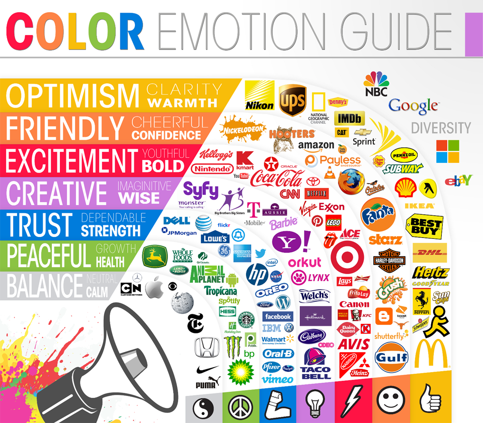
what do you guys think the color of your website can affect to decisions when a customer buys somethings from it?
Which color you like best when viewing a website?
what do you guys think the color of your website can affect to decisions when a customer buys somethings from it?
Which color you like best when viewing a website?
 . Most of these types of websites will be white or an off white color depending on the church as well..
 or creepy pastas then I prefer the black background and the white text. It makes it more creepy.
